
Mosh
Mobile Application
View This Prototype on Desktop
For the best experience, please visit this page on your desktop to explore the interactive prototype.
Open PrototypeProject Overview
The goal for this project was to address multiple user needs (availability, price point, etc.) in a single digital space for cohesive planning.
Role: Primary UX Researcher / UI Designer
Timeline: 2 weeks
Team: 4 researchers/designers
Tools: Figma, Figjam, Google, Miro
The Problem
People often struggle to make plans with friends, family, or colleagues because everyone has different budgets, schedules, and preferences. The process usually involves endless group texts, confusing polls, or missed opportunities. This leads to frustration, wasted time, and in many cases, canceled or unsatisfying plans. There is a need for a streamlined, democratic way to organize activities that balances individual preferences with group decision-making.
Research
Competitive Analysis
We reviewed both direct and indirect competitors such as Hang Time, Splitwise, Facebook Messenger, and LinkMood. From this, we knew we wanted to focus on the following features:
Creating unique groups
Calendar compatibility
Polling systems
Interviews & Survey
90% of interviewed and surveyed individuals belonged to multiple friend groups and claimed scheduling was the biggest hurdle when making plans.
85% of surveyed individuals used iMessage or SMS to communicate plans.
81.4% of participants were flexible after plans were made.
Ideation
Affinity Diagram
We compiled our research and separated our data into corresponding groups such as Group Habits, Desired Features, and Pain Points.
Feature Prioritization
Our team utilized the 'I like, I wish, what if' method and a feature prioritization matrix to hone in our features focus.
Storyboard

Style Guide
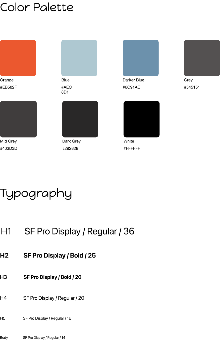
We opted for a 'Dark Mode' appearance with orange and blue as our main colors. Our typography was chosen because of its easy-to-read nature and its affiliation with iOS made it recognizable.
Wireframes
We had 3 phases of iterations prior to user testing:
Sketch
Low-Fidelity
Mid-Fidelity (Interactive)
Testing
Users navigated our mid-fidelity prototype to complete the following set of tasks:
Log in to Mosh
Create a new Circle
Initiate and vote on a group activity
View an upcoming event
Feedback
Navigation bar is too large and unclear
Add final itinerary to view event after creation with option for calendar sync
Cards are very large and take up a lot of space on the homepage.
Improvements
Navigation
We improved this by decreasing the size of the icon and adding a label.
We removed the plus sign, and added 'new event' to a different flow.
Cards
Cards were reduced in size without compromising space for event details. Photos were added so name of group wouldn't take up more space.
Finalized Itinerary
Expanded view of event with details added to home page.
User can add event to their phone calendar by pressing the calendar button on the event page.
Prototype
