
Sawtooth Adventure Company
Website Redesign
-

Active users increased 112%
-

Organic social engagement up 257%
-

Improved donation completion rate by 40%
Project Overview
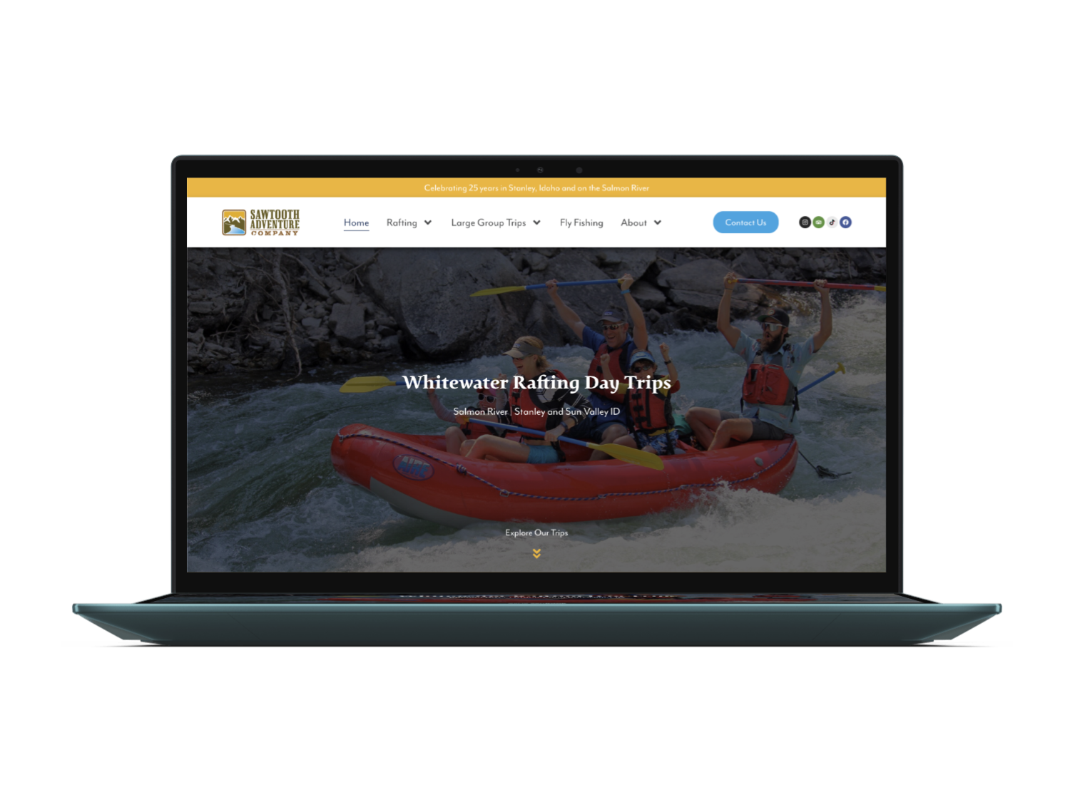
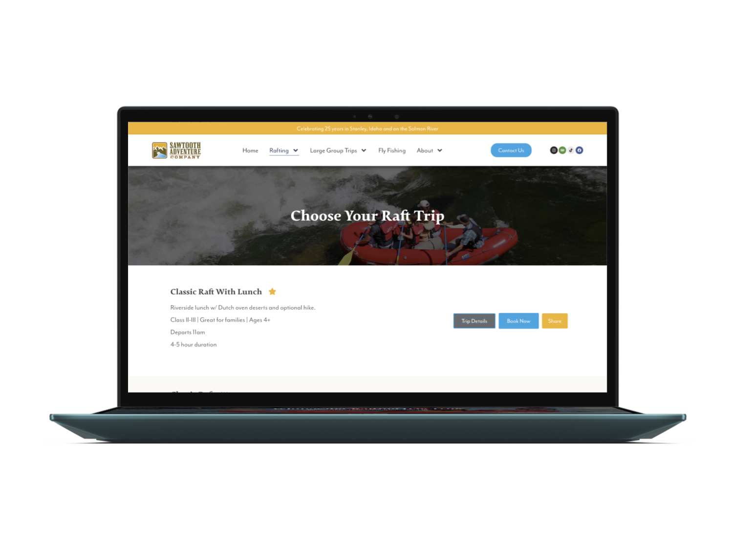
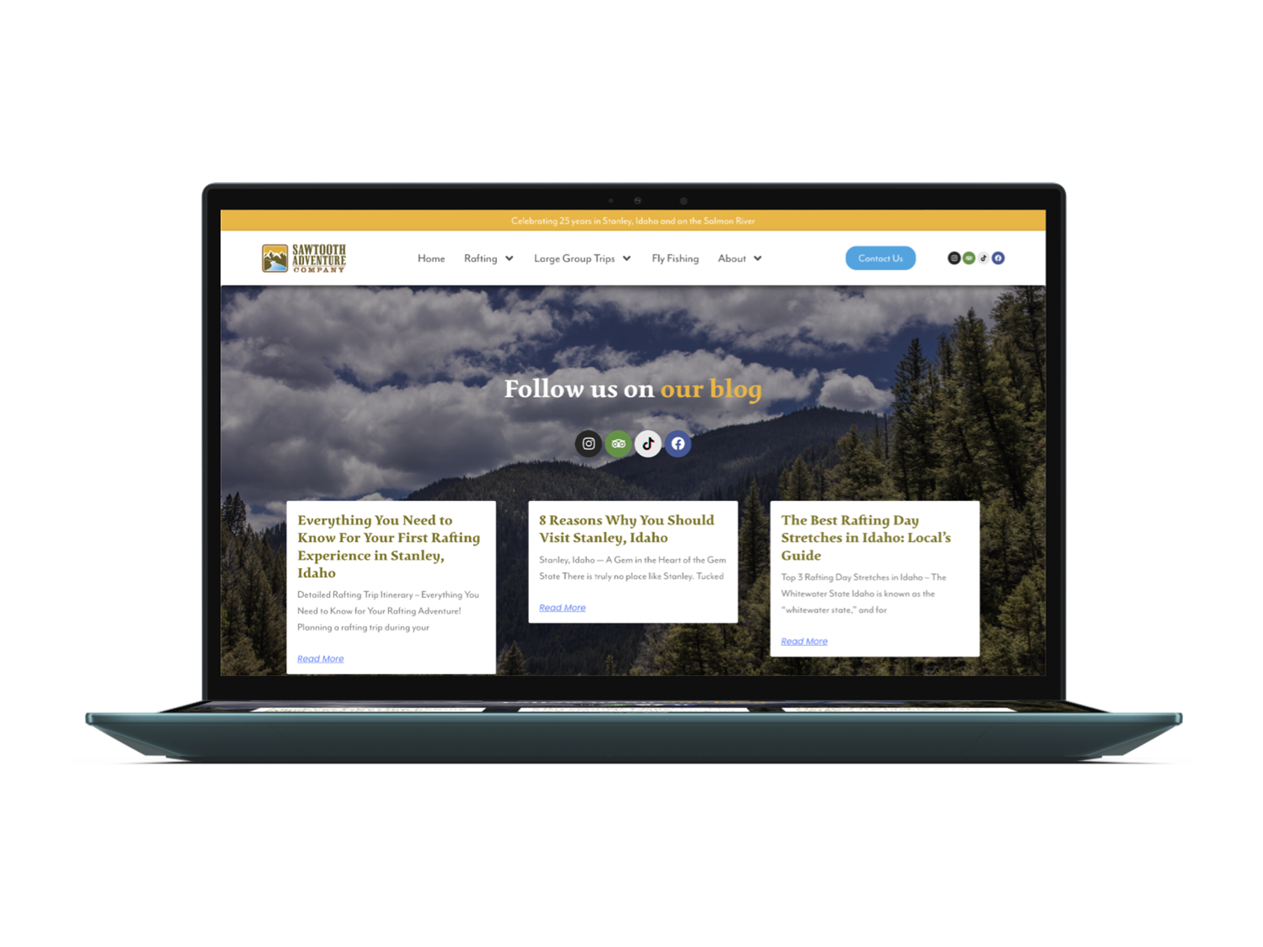
This website redesign focused on improving the interface and user experience for a beloved single-day river rafting company in Stanley, Idaho: Sawtooth Adventure Co.
Role: UX Researcher / UI Designer / Site Builder
Timeline: 6 months
Team: Confluence Marketing (project managers); Madison Macrae Design (UX/UI/Development)
Platforms: WordPress, Elementor Pro, custom HTML/CSS/JavaScript
Tools: Figma / Claude (AI)
The Problem
The original website for SAC was built 20+ years ago using WordPress’s most basic features and tools. The site was full of important content and information, but the organization and navigation were lacking.
Research
Background & Context
Modest Needs is a nonprofit organization offering short-term financial assistance. Their website serves as the primary platform for donations and applications, making usability and clarity critical to their mission.
Heuristic Evaluation
Our team identified several usability and design issues:
Grey and outdated UI
Inconsistent card sizes / no grid
No hierarchy
Too wordy
Competing elements / no clear call-to-action
Interviews
71.8% of surveyed individuals (7 virtual and in-person) indicated they would be more likely to contribute money toward a cause than perform a service. 80.5% of those preferred paying via credit / debit card, or an alternative quick-pay option such as: Apple Pay, PayPal, etc.
Competitive Analysis
We analyzed competitors such as GoFundMe, Kiva, Kickstarter, and ASPCA and reviewed their advantages, strengths weaknesses, and features. Several of these competitors were well known but struggled with issues such as:
Does not support all payment types
Must pay to use application
Can’t guarantee that funds will be delivered to intended recipient / easy to create fake accounts

Ideation
Feature Prioritization Matrix
We utilized the ‘I Like, I Wish, What If’ method to brainstorm potential features
We drew from our previous research to identify user pain points and desirables
By comparing complexity to impact, we could determine how to prioritize our design features
Layout Ideation Workshop
1 Hour to Brainstorm, Sketch, and Discuss
4 Iterations
Information Architecture
The original header was redundant and lacked organization. We dove into the existing user flows and consolidated the information into a simplified navigation menu. The refined header ensured all information was accessible by utilizing drop-downs. We also included a search bar as an alternate flow to access information.
This redesign helped to identify the main call-to-actions: fundraise and donate.
User Testing
Our user testing plan was primarily based on design, navigation, and functionality of the site. Test participants used our mid-fidelity prototype to perform the following tasks:
Make a donation
Navigate through the site's pages
Interact with components
Provide feedback on what is working, and what is not
Feedback
Cards have too much content
Individual donation page has a lot of contradicting elements
Payment Flow is choppy and frustrating. There is a lot going on.
Improvements
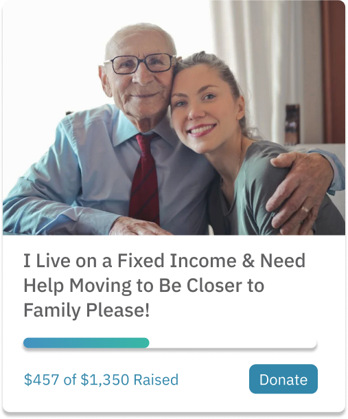
Cards
We improved this by increasing the size of the image and removing the application description.
We also redesigned the status bar for a more streamlined look and removed the grey background.
Individual Donation Page
I improved this by reducing the amount of color on the page.
Instead of having elements separate, I put all information into one card so the information displays more cohesively.
I changed the black text to a dark grey which is a lot nicer on the eye.
Instead of having all information on the page at once, I added a feature allowing the user to expand and shrink the applicant's full story to make it less intimidating.
Payment Flow
I created a new payment flow that simplified the process and allowed users to complete their payment on one screen.
I simplified the UI to match the rest of the site's more minimal design.
Prototype
